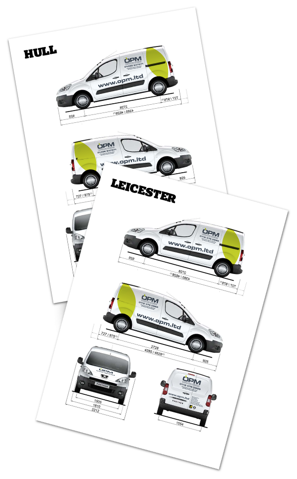
Orchard Property Maintenance were recommended to us, when they were in need of a slight re-brand. The brief was to shorten the name from Orchard Property Maintenance to OPM in order to be more punchy and modern. We were asked to come up with a logo which in turn would be used on stationery, website and vehicles.
Having explored several options and trying to avoid all of the clichés, we kept with a text based logo, using a bold, modern looking typeface and added a simple, modern leaf shape, in a bright green, within the O to hint of an apple.