The Waterside

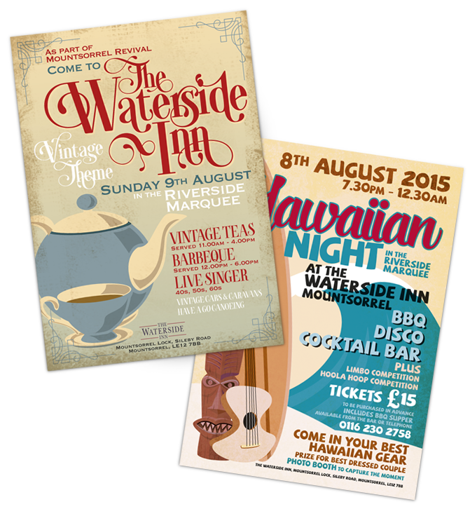
The Waterside Inn, situated on the banks of the river Soar in Mountsorrel, Leicestershire, approached us to come up with some design ideas for posters to promote events held at the pub.

One of their regular functions is the ‘Friday Social’, a weekly get together offering free bar nibbles and drink offers. We created its own logo so that anything related to the Friday Social can be instantly recognised, helping to link promotions together regardless of the main image style. The design brief was to make the posters humorous and have impact. This was achieved through the image and strap lines.

Other posters were designed for the Tuesday Steak Night and their Sunday Roast.
Having used a ‘one stop shop’ for their previous printing, they came to Lee White Design having been recommended by one of our clients.

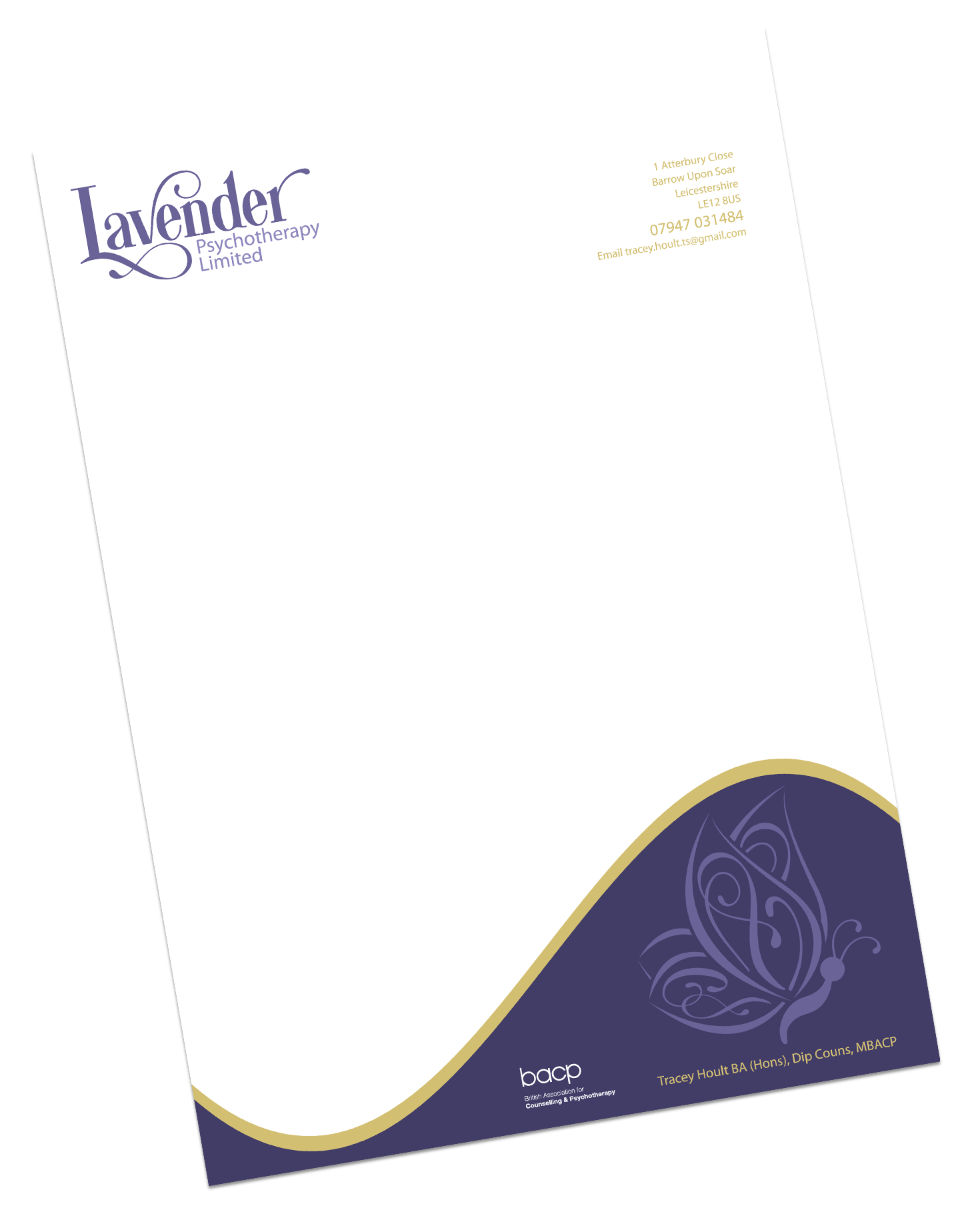
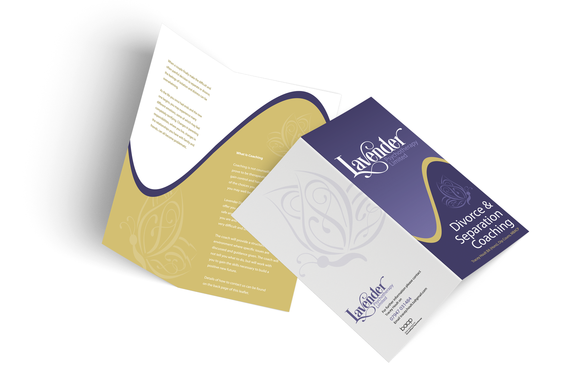
We established that a logo was needed as they had previously been using a generic font throughout and so the company needed a clearer identity. We were very aware that due to the name the obvious use of the flower could very easily portray the wrong message i.e. florist or nursing home. We steered away from an actual icon logo and kept with a text based logo, using a more decorative and softer typeface. To compliment this and to go along with the divorce and separation coaching that the company specialised in, we designed a butterfly to represent a new beginning, starting again or spread your wings.

Along with the logo, leaflets and compliment slips were designed using complimentary colours and curves to bring everything together.

Lavender

Unitycomm

We were asked to design an eBrochure for each of the clients 3 services. It needed to put over what they did in a simple, down to earth and informal way. Come away from the normal ‘techno babble’. To compliment this, icons were needed for the various aspects of IT services. The client gave us almost carte blanche on this one. After a few feeler ideas, which went down well, such as coming up with the title ‘Simply Brilliant’, the project took off. We played very much around the ‘Simply Brilliant’ aspect, using the words throughout the brochures. We also included a few humorous/straight talking highlights. The icons were made large to generalise on the subject on each page, and the use of an arrow guided the viewer through the brochure, pinpointing important sections but in an informal manner.

“We find Lee White Design exceptionally good at interpreting our ideas and transforming them into compelling design and content. As a result we’re rolling out consistent branding across all our media and look forward to working with them on exciting projects in the years to come.

Their fast turn around and competitive rates are the cherry on the top. I have no hesitation recommending Lee White Design.”

Simon Ghent
Unitycomm Ltd

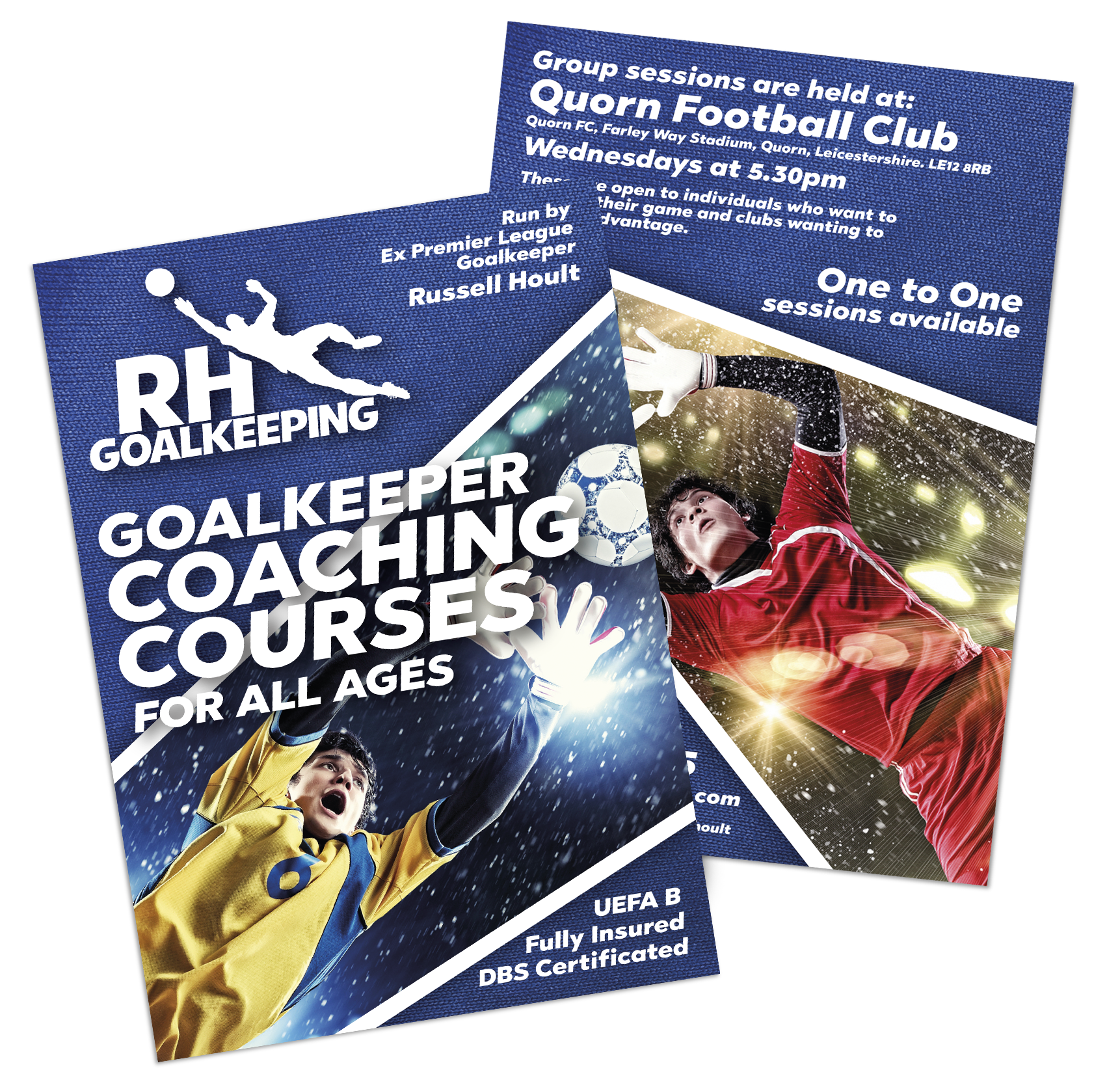
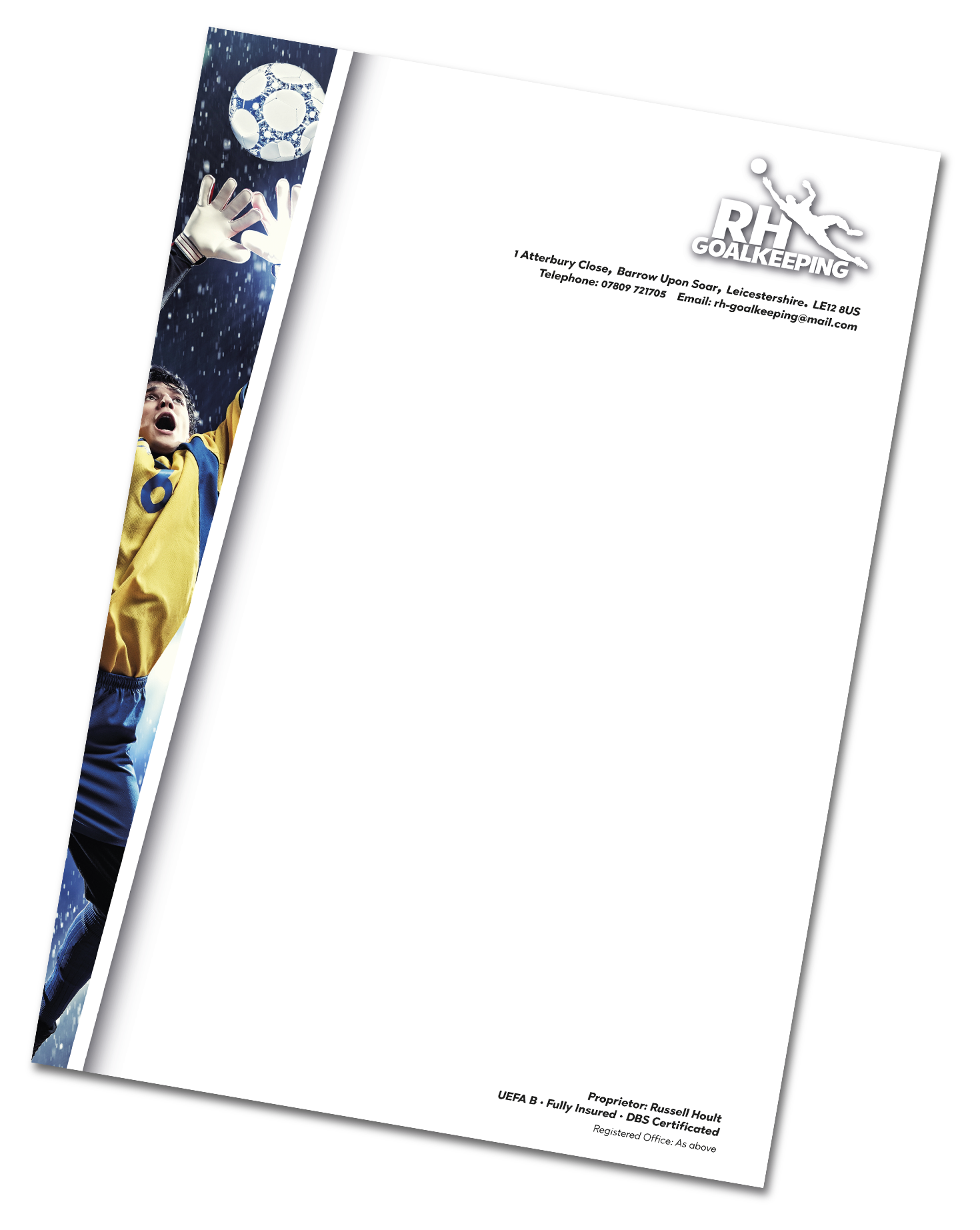
Ex Premier League Goalkeeper, Russell Hoult came to see us when he had started up a Goalkeeper Coaching business. The project consisted of A5 leaflets, Business Cards, Letterheads and a small Certificate.

RHGoalkeeping

Thrussington Garage

Alongside this, Sam Smith Motor Retail, a friend of Thrussington Garage, started working closely with them, with his car sales company and so decided to have his name in the same style as Thrussington Garage, hence the two versions of logo. This was to again alleviate confusing customers, as they were trading from the same building.

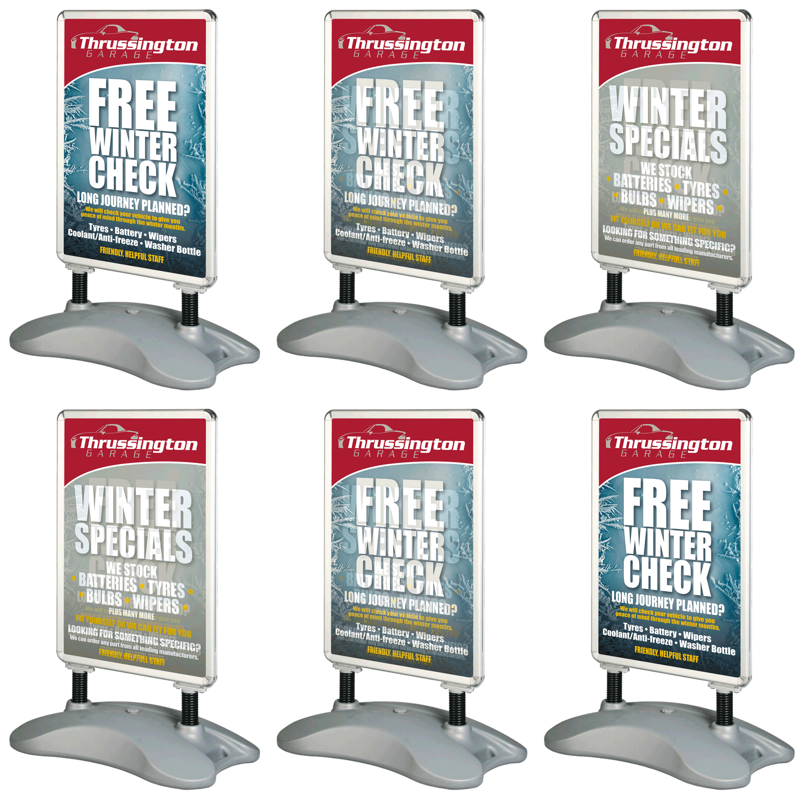
After producing the logos, business cards were needed along with a sign and a few posters.

Thrussington Garage first approached us when they needed some flyers producing. Since then we have had a great working relationship with them. They asked us to come up with a new logo and branding. Having gave them a couple of completely new look ideas, they came to the conclusion that it was best to stay close to what they had already got, so as not to confuse their customer base. Being a Mazda MX5 specialist, we took the profile of the MX5 and incorporated that with the name.

For our outdoor signs, we recommend Dibond which is extremely durable. With rust, fade and weather resistance, these resilient aluminium composite sheets last for years. Dibond is made from a polyethylene core sandwiched between two sheets of aluminium and is 3mm thick.

The Waterside

The Waterside Inn, situated on the banks of the river Soar in Mountsorrel, Leicestershire, approached us to come up with some design ideas for posters to promote events held at the pub.

One of their regular functions is the ‘Friday Social’, a weekly get together offering free bar nibbles and drink offers. We created its own logo so that anything related to the Friday Social can be instantly recognised, helping to link promotions together regardless of the main image style. The design brief was to make the posters humorous and have impact. This was achieved through the image and strap lines.

Other posters were designed for the Tuesday Steak Night and their Sunday Roast.
Having used a ‘one stop shop’ for their previous printing, they came to Lee White Design having been recommended by one of our clients.

We established that a logo was needed as they had previously been using a generic font throughout and so the company needed a clearer identity. We were very aware that due to the name the obvious use of the flower could very easily portray the wrong message i.e. florist or nursing home. We steered away from an actual icon logo and kept with a text based logo, using a more decorative and softer typeface. To compliment this and to go along with the divorce and separation coaching that the company specialised in, we designed a butterfly to represent a new beginning, starting again or spread your wings.

Along with the logo, leaflets and compliment slips were designed using complimentary colours and curves to bring everything together.

Lavender

Unitycomm

We were asked to design an eBrochure for each of the clients 3 services. It needed to put over what they did in a simple, down to earth and informal way. Come away from the normal ‘techno babble’. To compliment this, icons were needed for the various aspects of IT services. The client gave us almost carte blanche on this one. After a few feeler ideas, which went down well, such as coming up with the title ‘Simply Brilliant’, the project took off. We played very much around the ‘Simply Brilliant’ aspect, using the words throughout the brochures. We also included a few humorous/straight talking highlights. The icons were made large to generalise on the subject on each page, and the use of an arrow guided the viewer through the brochure, pinpointing important sections but in an informal manner.

“We find Lee White Design exceptionally good at interpreting our ideas and transforming them into compelling design and content. As a result we’re rolling out consistent branding across all our media and look forward to working with them on exciting projects in the years to come.

Their fast turn around and competitive rates are the cherry on the top.
I have no hesitation recommending Lee White Design.”

Simon Ghent
Unitycomm Ltd

Ex Premier League Goalkeeper, Russell Hoult came to see us when he had started up a Goalkeeper Coaching business. The project consisted of A5 leaflets, Business Cards, Letterheads and a small Certificate.

RHGoalkeeping

Thrussington Garage

Alongside this, Sam Smith Motor Retail, a friend of Thrussington Garage, started working closely with them, with his car sales company and so decided to have his name in the same style as Thrussington Garage, hence the two versions of logo. This was to again alleviate confusing customers, as they were trading from the same building.

After producing the logos, business cards were needed along with a sign and a few posters.

Thrussington Garage first approached us when they needed some flyers producing. Since then we have had a great working relationship with them. They asked us to come up with a new logo and branding. Having gave them a couple of completely new look ideas, they came to the conclusion that it was best to stay close to what they had already got, so as not to confuse their customer base. Being a Mazda MX5 specialist, we took the profile of the MX5 and incorporated that with the name.

For our outdoor signs, we recommend Dibond which is extremely durable. With rust, fade and weather resistance, these resilient aluminium composite sheets last for years. Dibond is made from a polyethylene core sandwiched between two sheets of aluminium and is 3mm thick.

The Waterside

The Waterside Inn, situated on the banks of the river Soar in Mountsorrel, Leicestershire, approached us to come up with some design ideas for posters to promote events held at the pub.

One of their regular functions is the ‘Friday Social’, a weekly get together offering free bar nibbles and drink offers. We created its own logo so that anything related to the Friday Social can be instantly recognised, helping to link promotions together regardless of the main image style. The design brief was to make the posters humorous and have impact. This was achieved through the image and strap lines.

Other posters were designed for the Tuesday Steak Night and their Sunday Roast.
Lavender

Having used a ‘one stop shop’ for their previous printing, they came to Lee White Design having been recommended by one of our clients.

We established that a logo was needed as they had previously been using a generic font throughout and so the company needed a clearer identity. We were very aware that due to the name the obvious use of the flower could very easily portray the wrong message i.e. florist or nursing home. We steered away from an actual icon logo and kept with a text based logo, using a more decorative and softer typeface. To compliment this and to go along with the divorce and separation coaching that the company specialised in, we designed a butterfly to represent a new beginning, starting again or spread your wings.

Along with the logo, leaflets and compliment slips were designed using complimentary colours and curves to bring everything together.

Unitycomm

We were asked to design an eBrochure for each of the clients 3 services. It needed to put over what they did in a simple, down to earth and informal way. Come away from the normal ‘techno babble’. To compliment this, icons were needed for the various aspects of IT services. The client gave us almost carte blanche on this one. After a few feeler ideas, which went down well, such as coming up with the title ‘Simply Brilliant’, the project took off. We played very much around the ‘Simply Brilliant’ aspect, using the words throughout the brochures. We also included a few humorous/straight talking highlights. The icons were made large to generalise on the subject on each page, and the use of an arrow guided the viewer through the brochure, pinpointing important sections but in an informal manner.

“We find Lee White Design exceptionally good at interpreting our ideas and transforming them into compelling design and content. As a result we’re rolling out consistent branding across all our media and look forward to working with them on exciting projects in the years to come.

Their fast turn around and competitive rates are the cherry on the top. I have no hesitation recommending Lee White Design.”

Simon Ghent
Unitycomm Ltd

RH
Goalkeeping

Ex Premier League Goalkeeper, Russell Hoult came to see us when he had started up a Goalkeeper Coaching business. The project consisted of A5 leaflets, Business Cards, Letterheads and a small Certificate.

Thrussington Garage

Thrussington Garage first approached us when they needed some flyers producing. Since then we have had a great working relationship with them. They asked us to come up with a new logo and branding. Having gave them a couple of completely new look ideas, they came to the conclusion that it was best to stay close to what they had already got, so as not to confuse their customer base. Being a Mazda MX5 specialist, we took the profile of the MX5 and incorporated that with the name.

Alongside this, Sam Smith Motor Retail, a friend of Thrussington Garage, started working closely with them, with his car sales company and so decided to have his name in the same style as Thrussington Garage, hence the two versions of logo. This was to again alleviate confusing customers, as they were trading from the same building.

After producing the logos, business cards were needed along with a sign and a few posters.

For our outdoor signs, we recommend Dibond which is extremely durable. With rust, fade and weather resistance, these resilient aluminium composite sheets last for years. Dibond is made from a polyethylene core sandwiched between two sheets of aluminium and is 3mm thick.

“…I found Lee White Design has a very straight forward approach to all types of design no matter what is asked of them. They listened to my ideas and delivered them in a prompt and friendly way.”

“…We have plenty of new projects planned and I will have no hesitation in calling on their services once more.”

Rob Comber
Thrussington Garage / Michael Comber Racing

“…I found Lee White Design has a very straight forward approach to all types of design no matter what is asked of them. They listened to my ideas and delivered them in a prompt and friendly way.

“…We have plenty of new projects planned and I will have no hesitation in calling on their services once more.”

Rob Comber
Thrussington Garage / Michael Comber Racing

Vapes

A local Vape company approached us, with a very tight deadline, asking us to design a label for their new range of vape flavours, that they wanted to launch at an exhibition they were attending.

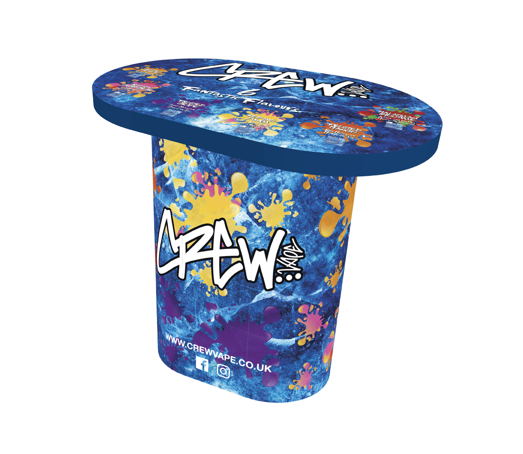
Working closely with them, we were able to develop a logo that suited their customer base. The brief was to make the labels stand out from the crowd when on the shelf amongst other vape brands. There were 6 different fruity flavours with 2 variants, Ice and Low Ice. We came up with a cool icy background with bright, striking fruit bursts.

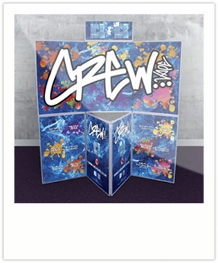
Having been pleased with the design that we had come with, the brief increased to include menus/leaflets. Along with a design for their stand and table. All this was achieved in time for the exhibition.

Exhibition Stand

Having been pleased with the design that we had come with, the brief increased to include menus/leaflets. Along with a design for their stand and table. All this was achieved in time for the exhibition.

Exhibition Stand

Having been pleased with the design that we had come with, the brief increased to include menus/leaflets. Along with a design for their stand and table. All this was achieved in time for the exhibition.