We felt it was important to keep the core look of the logo so remained recognisable, this was simplified to a single colour and the “swoop” extended into the main branding. We kept the blue for consistency, but darkened it. 2 more colours were chosen to compliment the blue.
This full brand refresh led to and extensive amount of work. Stationery was designed, to include business cards, letterheads, invoices, POD books.
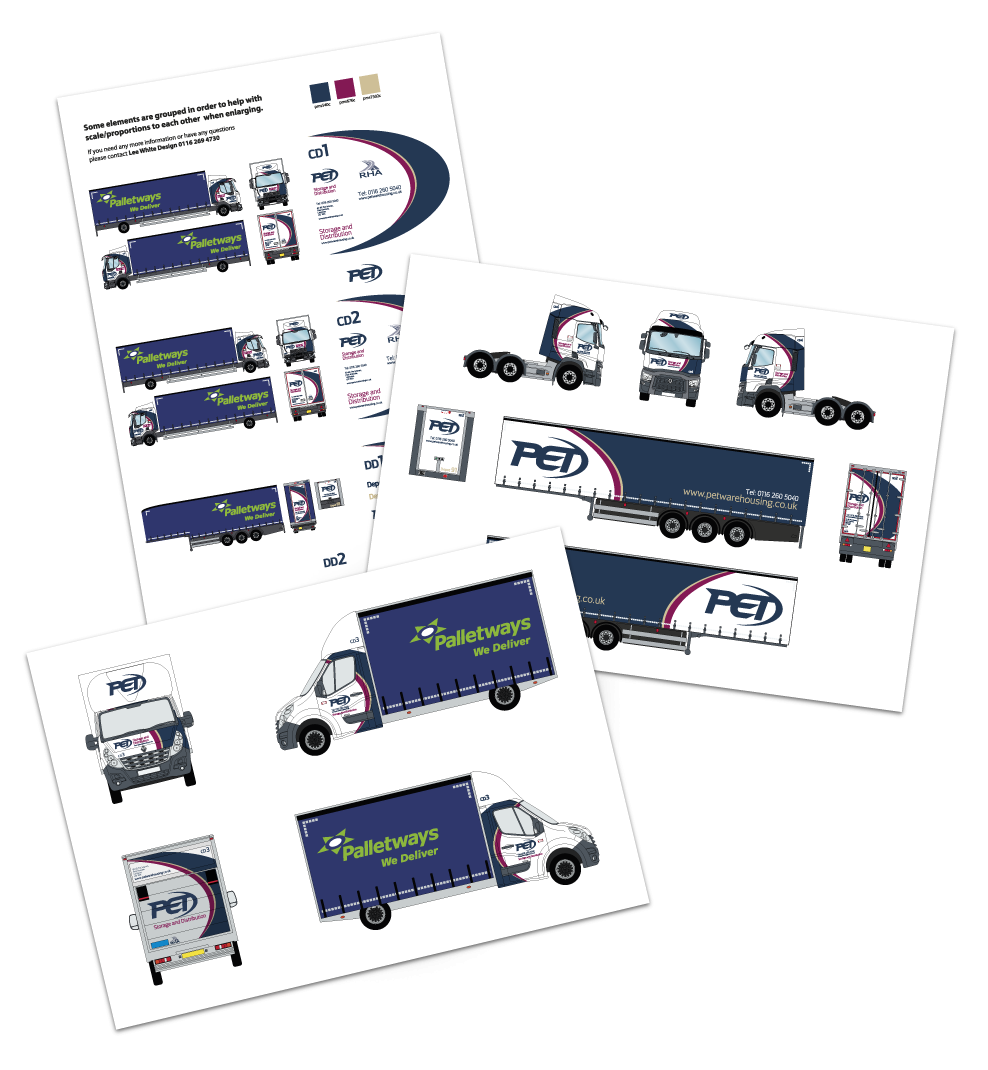
With there expansion into a pallet network, new vehicles were needed and so we were tasked with the livery design for 3 different size vehicles, along with trailer curtains.
This is still an ongoing project with signs being needed for all of their warehouses, to include company and safety signs.