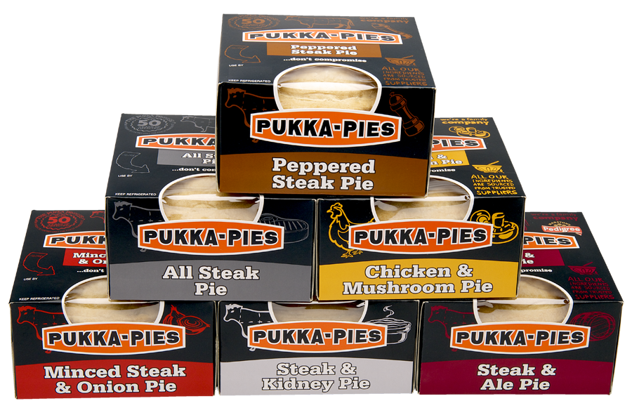
Back in 2015 we were delighted to be asked to work with Pukka Pies to update the packaging for their iconic pies.
Working closely with their marketing department, we produced several layouts to be put forward alongside other design company concepts. We were very pleased on hearing that our submissions had been chosen for further development.
The design brief was to give the packaging a clearer and fresher look without moving away from their recognisable branding. We felt that the cartons needed a softer feel. We started by reducing the size of the logos and text on the side panels to give a more refined look.
We wanted to produce a consistent look throughout the full range. To convey the flavour title, we opted for a colour ‘drop down ribbon’ with a curve at the bottom replicating the Pukka Pies logo, further enhancing the softer appearance. The original packaging used illustrations linked to the flavour of the pie and we adapted these and set about drawing further elements for some of the other varieties. In addition to this we made them more of a feature. Add to that the unique flavour colour on the black background and each pack is easily identifiable to it’s flavour.
A window needed to be included so that you can see the pie inside, this is something that has worked very well for the bigger family pies and was important to include on the individual pies too.
Carton mock ups were then sent for intensive market research and were received very well, with plenty of positive comments and feedback. The final design was refined ready for print and the full range can now be found in leading supermarkets
